Introduction: The Power of Branding in Health Coaching

In health coaching, your logo isn't just a pretty picture next to your name. It's the face of your brand, and it tells your story without saying a word. Think of the biggest brands you know. Their logos are more than images; they're symbols of trust, quality, and experience. That’s what you want for your health coaching business. A strong logo grabs attention, makes a memorable impression, and separates you from the competition. It communicates essential information about your business and what it stands for. Your logo also plays a critical role in building brand loyalty. Once people connect with your brand through its logo, they’re more likely to stick with you. So, investing in a powerful logo isn’t just about good looks; it’s about creating a lasting relationship with your audience.
What Makes a Logo Strong?
A strong logo grabs attention. It's that simple. Think of the most famous brands. Their logos aren't just pictures; they're symbols people everywhere recognize. A strong health coaching logo does the same. It conveys your brand's message without shouting it. How? First, it's memorable. Your logo sticks in people's minds. They see it once, and they remember it. Next, it's simple. Not cluttered or complicated. The best logos are easy to look at and easy to understand. Then, it's relevant. Your logo reflects what you do. If you're all about health, maybe it shows something healthy. Finally, it’s adaptable. It looks good on a business card, a website, or a billboard. No matter where it is, it's clearly your brand. Stick to these principles, and your logo will be strong.
Elements of Effective Health Coaching Logos
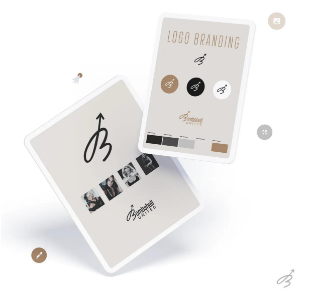
Great health coaching logos share a few common traits. They're simple, memorable, and reflect the essence of the service. Simplicity means your logo should be straightforward with clean lines - think of the Nike swoosh. Memorability comes from a logo being easy to recognize, making it stick in people's minds. Finally, the essence is about ensuring your logo tells a story about health and wellness. Colors play a big role too. Green often stands for growth and wellness, while blue can evoke feelings of calm and trust. Your logo might also include elements that symbolize transformation or vitality, like a rising sun or a human figure in motion. Every part of your logo from the design, color, to the symbolism, should aim to communicate health, vitality, and the transformative journey of health coaching. Keep it straightforward, engaging, and true to your brand's mission.

Colors and Their Impact in Health Coaching Logos
Colors aren't just pretty; they're powerful. When it comes to health coaching logos, choosing the right colors can make or break your brand. Let's break this down simply. Red grabs attention. It's energetic and can signal passion or urgency. Use it if you want to stir excitement. Blue is your friend for trust. It's calming and often linked with dependability and strength. Ideal for saying, "You can count on us." Green is a no-brainer for health. It's about renewal, growth, and, of course, health itself. It screams, "We're all about your wellbeing." Yellow shines with optimism. It's all about happiness and energy. Perfect for brands that want to be seen as uplifting and friendly. Orange mixes the excitement of red with the cheerfulness of yellow. It's great for a brand that's all about fun and vibrant energy. Purple brings a touch of luxury. It's associated with wisdom and dignity, great for a brand aiming for a sophisticated edge. Black speaks elegance and sophistication. It's sleek, powerful, and screams premium service. Remember, the right color doesn't just look good. It communicates what your brand stands for at a glance, connecting you to your ideal audience without saying a word. Choose wisely, and let your colors speak volumes about your health coaching brand.

Fonts and Typography: How They Shape Perception
Fonts and typography in logos do more than just display your brand's name. They deeply influence how people see your brand. Think of fonts as the clothes your words wear. Just as you'd pick a suit for a job interview or sneakers for a run, the right font for your health coaching brand tells a story. A bold, strong font might convey confidence and power, perfect for a brand that's all about pushing limits and achieving physical goals. On the other hand, a soft, flowing font could communicate care, warmth, and a more holistic approach to health. It's not just about looking good; it's about creating a connection. When potential clients see your logo, the font you choose can immediately give them a feel for your coaching style and values. Whether it's the reliability and trust you want to emphasize or the transformative journey you guide them on, the right typography can make your brand memorable and relatable. Remember, every font has its own personality, and picking the one that aligns with your brand’s identity can significantly impact how your audience perceives and remembers you.
Imagery in Logos: Icons Vs. Text
Choosing the right imagery for your health coaching logo boils down to two main choices: icons or text. Icons, those little pictures that say a thousand words, pack a powerful emotional punch. They can capture the essence of your health coaching philosophy in a single glance. Think about a heart for wellness or a leaf for natural health. These symbols can make your brand instantly recognizable. On the flip side, text-based logos focus on the name of your brand, maybe with a unique font or style. They rely on the strength of your brand's name to carry the visual weight. A bold, clear font says you mean business, while a more relaxed script might convey a gentler approach to health. The kicker? There's no right or wrong choice. It's about what speaks to you and represents your brand best. Icons are great for making a quick, visual impact, while text logos bank on brand recognition over time. Some brands even mix both for the best of both worlds. In short, whether you choose an icon, text, or a combo, make sure it aligns with your brand's vibe and goals.

The Psychological Effect of Health Coaching Logos.
Health coaching logos do more than just look pretty; they work hard. They are not just symbols; they are tools that communicate. A well-designed logo can talk directly to the subconscious mind of potential clients. It's like the logo is whispering, "Trust us, we know what's best for your health." This isn't just fluff; it's backed by science. Colors, shapes, and even the font used in the logo can influence how a person feels about your health coaching brand before they've even spoken to you.
Think about it – a logo with soft, natural colors and gentle curves can give off a vibe of calm and wellness. It says without saying, "We care about your wellbeing." On the other hand, sharp lines and bold colors might communicate strength and efficiency. It tells a potential client, "We are here to get you results."
This psychological impact can make or break a person's decision to engage with your health coaching services. A logo that resonates on an emotional level can attract more clients by speaking directly to their desires and needs. It's not just decoration; it's a powerful form of non-verbal communication that can help your brand stand out and connect deeply with your target audience. So, when thinking about your health coaching logo, remember it's not just about looking good. It's about feeling right to those you wish to serve.
How to Create or Redesign Your Health Coaching Logo
Creating or redesigning your health coaching logo is not rocket science, but it does take some thought. Think of your logo as the face of your brand. It needs to say who you are and what you stand for at a glance. To start, ask yourself what makes your health coaching unique. Is it your focus on holistic well-being, your personal approach to fitness, or your commitment to sustainable health practices? Your logo should reflect this. Use clean, bold lines and colors that represent health and vitality - think green for growth, blue for calm, or even vibrant oranges or yellows to show energy and enthusiasm. Simplicity is your friend. A logo that's too busy or complicated confuses people. You want something that's memorable and easy to recognize, even when it's small. Consider involving a professional designer. While there are plenty of DIY design tools out there, a professional can bring your vision to life accurately and might provide insights you hadn't considered. Lastly, make sure your logo looks good in various formats, from your website to social media to print materials. Test it out in different sizes to ensure it maintains its impact. By focusing on these key aspects, you'll create a health coaching logo that not only stands out but also authentically represents your brand's mission and values.
Real-World Success Stories: Health Coaching Logos That Work
When we talk about health coaching logos that really hit the mark, few stories stand out like the iconic apple of Weight Watchers or the simple tick of Nike. These symbols do more than just catch your eye; they communicate the brand's core message at a glance. For instance, Weight Watchers’ apple is not just about eating healthy; it's about making smart choices and transforming your lifestyle. The logo's simplicity makes it memorable, while its message inspires action. On the other hand, Nike’s tick, known worldwide as the “Swoosh,” stands for movement, progress, and achieving your goals, no matter how big they are.
These brands understood that a strong logo needs to be more than just visually appealing. It has to convey the essence of what the brand stands for. This is why when health coaches invest in a logo, they see it as more than just a design project; it's the first step in defining their brand's identity. As these success stories show, a well-crafted logo not only elevates a brand’s image but also encapsulates its mission, making a lasting impression on its target audience.

Conclusion: Next Steps in Empowering Your Brand
Now that we've talked about the power of health coaching logos, it's clear that a strong logo does more than just look good. It communicates your brand’s values, attracts your target audience, and helps you stand out in a crowded market. The next step? Action. Start by evaluating your current logo. Does it reflect your brand's essence? Is it appealing to your target demographic? If not, it might be time for a redesign. Don't rush this process. Consider hiring a professional designer who understands the health and wellness industry. Remember, your logo is often the first interaction people have with your brand. Make it count. With the right logo, you're not just enhancing your brand's appearance—you're empowering your business to connect, engage, and thrive in the competitive world of health coaching.

TECHNOLOGIES WE
WORK ON
- Make

- Make
- Make
- Make
- Make
- Make
- Make
- Make
- Make
- Make
- Make
- Make

- GoHighLevel
- GoHighLevel
- GoHighLevel
- GoHighLevel
- GoHighLevel
- GoHighLevel
- GoHighLevel
- GoHighLevel
- GoHighLevel
- GoHighLevel
- GoHighLevel
- GoHighLevel

- Shopify
- Shopify
- Shopify
- Shopify
- Shopify
- Shopify
- Shopify
- Shopify
- Shopify
- Shopify
- Shopify
- Shopify

- WordPress
- WordPress
- WordPress
- WordPress
- WordPress
- WordPress
- WordPress
- WordPress
- WordPress
- WordPress
- WordPress
- WordPress

- React
- React
- React
- React
- React
- React
- React
- React
- React
- React
- React
- React


- WebFlow
- WebFlow
- WebFlow
- WebFlow
- WebFlow
- WebFlow
- WebFlow
- WebFlow
- WebFlow
- WebFlow
- WebFlow
- WebFlow
- WIX
- WIX
- WIX
- WIX
- WIX
- WIX
- WIX
- WIX
- WIX
- WIX
- WIX
- WIX

- Squarespace
- Squarespace
- Squarespace
- Squarespace
- Squarespace
- Squarespace
- Squarespace
- Squarespace
- Squarespace
- Squarespace
- Squarespace
- Squarespace

- Next.js
- Next.js
- Next.js
- Next.js
- Next.js
- Next.js
- Next.js
- Next.js
- Next.js
- Next.js
- Next.js
- Next.js

- Click Funnels
- Click Funnels
- Click Funnels
- Click Funnels
- Click Funnels
- Click Funnels
- Click Funnels
- Click Funnels
- Click Funnels
- Click Funnels
- Click Funnels
- Click Funnels