5 Crucial Tips from a Graphic Designer for Elevating Your Fitness Brand

In the bustling world of fitness, standing out is both an art and a science. Dive into the creative essence of branding with these top-notch design tips, handpicked by a seasoned graphic designer to electrify your fitness brand. Transform from blending in to leading the pack, one vibrant design choice at a time.
Understanding Your Fitness Brand’s Identity
Identifying your fitness brand’s identity is the cornerstone of effective graphic design. This process goes beyond surface-level aesthetics; it involves a deep dive into the values, goals, and ethos that make your brand unique. A well-defined identity shapes all visual elements, from logos to social media graphics, ensuring they resonate with your target audience. It's about telling your brand’s story through visual cues that spark interest and foster brand loyalty.
Taking the time to research your audience's preferences and pain points can dramatically impact how you're perceived in the competitive fitness landscape. A brand that's all about high-intensity workouts and pushing limits might favor bold, dynamic designs, while one that promotes wellness and balance may opt for serene, minimalist aesthetics.

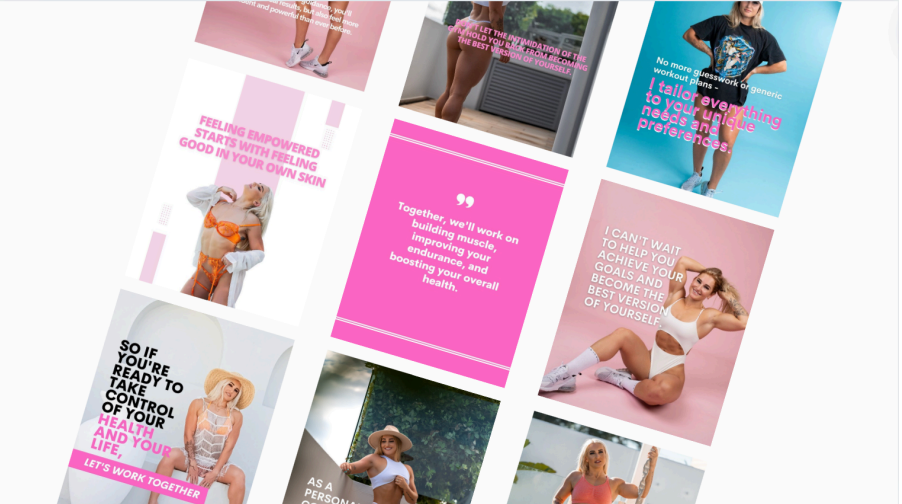
Leveraging Color Psychology to Motivate Your Audience
Colors wield the power to evoke emotions and catalyze actions. In the realm of fitness, leveraging color psychology can be a game-changer. The adrenaline rush of reds, the calm of blues, and the energy of oranges can all be strategically used in your brand's visual language to not only grab attention but also inspire your audience. Adapting your color palette to reflect the core emotions associated with your fitness goals can significantly enhance member engagement.
Creating a color scheme isn't just about personal preference; it’s about what works for your brand and communicates your values effectively. A vibrant, energetic color palette can be inviting for a brand targeting young, dynamic fitness enthusiasts, while more subdued, earthy tones might appeal to those seeking wellness and mindfulness.
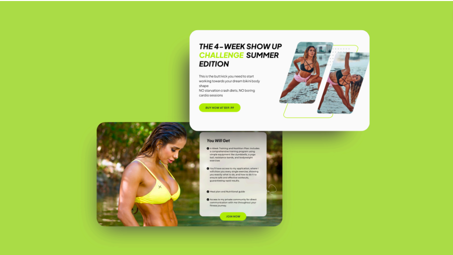
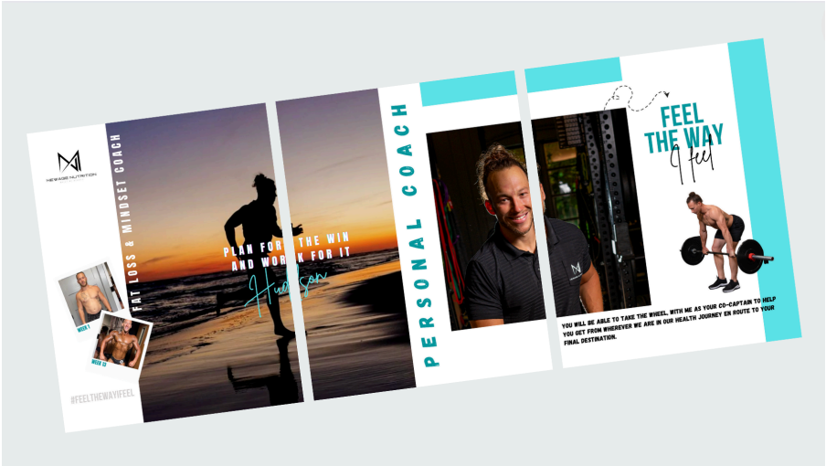
Incorporating Dynamic Imagery to Showcase Energy and Movement
Imagery is the heartbeat of any fitness brand, illustrating the energy and movement that define the sector. Action shots, dynamic poses, and compelling before-and-after photographs can be powerful motivators. They don't just depict your services; they showcase the journey and the transformation that is possible. Incorporating such dynamic imagery not only enhances your brand's visual appeal but also helps potential clients visualize their success.
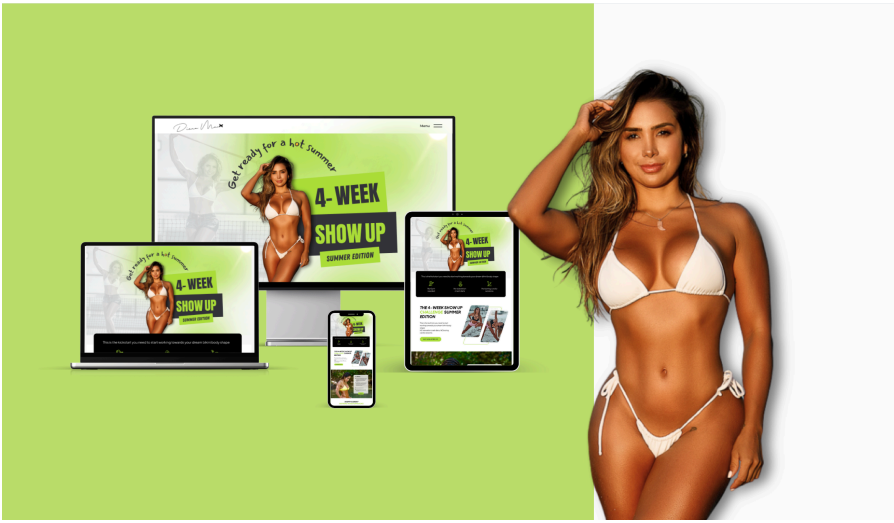
Developing a Consistent Visual Language Across All Platforms
In today's digital world, your brand will be encountered across an array of mediums—from your website to social media to physical marketing materials. Achieving consistency in your brand's visual language is pivotal for recognition and trust-building. This entails standardized color schemes, fonts, logo usage, and imagery that remain consistent across all touchpoints. Such consistency ensures that your brand is immediately recognizable and reinforces your professional image. Crafting guidelines for your visual identity ensures your brand remains cohesive wherever it appears.
Regular audits of your visual assets across platforms can help identify any discrepancies that might dilute your brand identity. Keeping everything aligned is crucial for creating a seamless and professional user experience that reflects the quality and dedication of your fitness brand.
Harnessing the Power of Typography to Communicate Your Brand’s Tone
Typography, often an underestimated tool in a designer's arsenal, plays a crucial role in setting the tone for your fitness brand. The right typeface can communicate strength, agility, sophistication, or fun. Whether it’s the boldness of a heavy sans-serif or the elegance of a clean serif font, your typographic choices should echo your brand’s personality and core messaging. Furthermore, consider the readability across various mediums, ensuring your message is accessible to everyone.
Seal the Deal with Stellar Design
IElevating your fitness brand is more than just visual aesthetics; it's about creating a resonant identity that speaks directly to the soul of your audience. By employing strategic color choices, dynamic imagery, consistent visual language, and impactful typography, your fitness brand can transform into an emblem of motivation and health. Remember, a well-designed brand doesn't just attract attention; it inspires transformation.
TECHNOLOGIES WE
WORK ON
- Make

- Make
- Make
- Make
- Make
- Make
- Make
- Make
- Make
- Make
- Make
- Make

- GoHighLevel
- GoHighLevel
- GoHighLevel
- GoHighLevel
- GoHighLevel
- GoHighLevel
- GoHighLevel
- GoHighLevel
- GoHighLevel
- GoHighLevel
- GoHighLevel
- GoHighLevel

- Shopify
- Shopify
- Shopify
- Shopify
- Shopify
- Shopify
- Shopify
- Shopify
- Shopify
- Shopify
- Shopify
- Shopify

- WordPress
- WordPress
- WordPress
- WordPress
- WordPress
- WordPress
- WordPress
- WordPress
- WordPress
- WordPress
- WordPress
- WordPress

- React
- React
- React
- React
- React
- React
- React
- React
- React
- React
- React
- React


- WebFlow
- WebFlow
- WebFlow
- WebFlow
- WebFlow
- WebFlow
- WebFlow
- WebFlow
- WebFlow
- WebFlow
- WebFlow
- WebFlow
- WIX
- WIX
- WIX
- WIX
- WIX
- WIX
- WIX
- WIX
- WIX
- WIX
- WIX
- WIX

- Squarespace
- Squarespace
- Squarespace
- Squarespace
- Squarespace
- Squarespace
- Squarespace
- Squarespace
- Squarespace
- Squarespace
- Squarespace
- Squarespace

- Next.js
- Next.js
- Next.js
- Next.js
- Next.js
- Next.js
- Next.js
- Next.js
- Next.js
- Next.js
- Next.js
- Next.js

- Click Funnels
- Click Funnels
- Click Funnels
- Click Funnels
- Click Funnels
- Click Funnels
- Click Funnels
- Click Funnels
- Click Funnels
- Click Funnels
- Click Funnels
- Click Funnels